


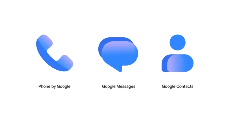
Google finished rolling out its new gradient icons for Messages and Contacts this week, closing out a two-week refresh across three communication apps. The changes keep the same shapes, but make the icons slightly larger and better fit the circular backgrounds.
That is why the update is showing up now: Google Contacts, the last Android icon to be refreshed, reached version 4.92.26.x on Wednesday evening, while Phone by Google had already landed on stable users on Monday. The result is a cleaner look across Google Messages, Contacts and Phone without changing what those icons actually show.

Contacts remains a head-and-body symbol, Messages still uses overlapping chat bubbles and Phone still uses a handset. Google also shifted to a lighter shade of blue and added a gradient effect, while describing the new Messages icon as “sharper, crisper, and clearer than ever before.”
The icon work is the part that is done. What is not done is the bigger homepage redesign for Google Messages, which is still confined to the beta channel. So for now, users are getting the new logo treatment without the larger interface change that appears to be next.
For anyone watching the rollout through 9to5Google, the immediate story is simple: Google has completed the visual refresh across its core communication apps, but the broader Messages redesign has not yet moved to stable users.