


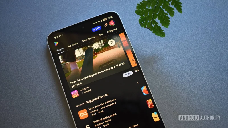
The next time users open the Google Play Store, the Games and Apps tabs may look different. A redesign that puts those sections into pill-shaped containers is now starting to roll out widely.
That matters because these are two of the store’s main entry points, and the change alters how people move through them. In the older layout, users saw separate tabs for For you, Top charts, Kids and Categories, while Games also included Premium. The new look removes For you as a tab and makes it the default home page in both sections.
The shift also changes what happens when someone taps deeper into the store. Top charts and Categories now open separate pages instead of sitting in the main tab row, and users have to use the arrow in the top left corner to return to the home page. The Games section used to start with a header area showing a carousel of apps followed by a list of apps, but that structure is giving way to a cleaner tab design.
There is one clear limit to the rollout: the Books tab still uses the old UI. That means the redesign is spreading across the Google Play Store, but it has not reached every corner of the marketplace at once. Google Play Points has also lost the blue pill-shaped container it previously used at the top of the page, and badge notifications appear to have picked up a new style as well.
For users, the practical change is simple. What used to be a single browse screen in Games and Apps is becoming a set of deeper pages, and that can make the store feel more organized or more buried depending on how often someone relies on the old tabs. The open question is how quickly the rest of the Google Play Store, including Books, will follow the same design.
